As designers, using logo files is pretty much second nature to us – we work with them all of the time – which means it’s easy to forget just how confusing it can be for others to know which file to use, and how to use it correctly.
So why do we put so much effort into creating a comprehensive logo package? If you’ve ever felt the disappointment of seeing a logo you’ve spent hours creating only to be used incorrectly, you’ll know exactly why – and although you can’t control how others use your logo 100% of the time, you can significantly reduce the chances of misuse by providing a thorough logo package.
In this guide, I’ll walk you through my process for delivering a final logo package and share some best practices for preparing a professional set of files to ensure all the hard work you put into creating logos doesn’t go to waste. Feel free to follow this process to a ‘T’ or adjust it to align with your own process.
💬 If you have any questions or get stuck along the way, flick me an email.
Logo Package Process Overview
Here’s a quick overview of the steps in my process, and what you'll learn:
Step 1: Tidy up
Learn how to tidy up the vector, swatches, and artboard.
Step 2: Create logo variations
Learn what kind of colour and layout variations to provide.
Step 3: Package logo files
Learn about the file formats and colour modes you need to include, and how to structure the files inside a folder.
Step 4: Create guidelines
Learn which guidelines you should provide to ensure your logo files are used correctly.
Step 5: Deliver final logo package
Learn how to send the final logo package, gather feedback and debrief.
Alright, let's get into step 1...
👉 Some of the instructions in this guide are specific to Adobe Illustrator. If you’re using another vector program, the Illustrator-specific tips won't apply – but you can still use the info provided to apply a similar process.
Step 1: Tidy up
Now that you have a final approved logo, it’s time to tidy up. This is important because you need to ensure your logo file reproduces without errors when used.
For example, if the logo file is opened by an embroiderer, and your vector has hidden or messy layers, this creates opportunity for error – this could be in the way the machine translates the layers, or if the embroiderer tidies it up themselves. We want to avoid that, and we’ll do that with a well-prepared final file.
But first, you likely have many duplicated and tweaked elements surrounding your final logo and scattered around your artboard that you’ve created during your digitising process. Make sure to delete everything except your final logo elements, and save this as a ‘final’ version. Keep the messy version – just in case if you need to reference fonts or elements from before they were outlined and tidied up.
There are three sections to this step. First, tidy up the vector, next, tidy up the swatches, then tidy up the artboard.
Tidy up the vector
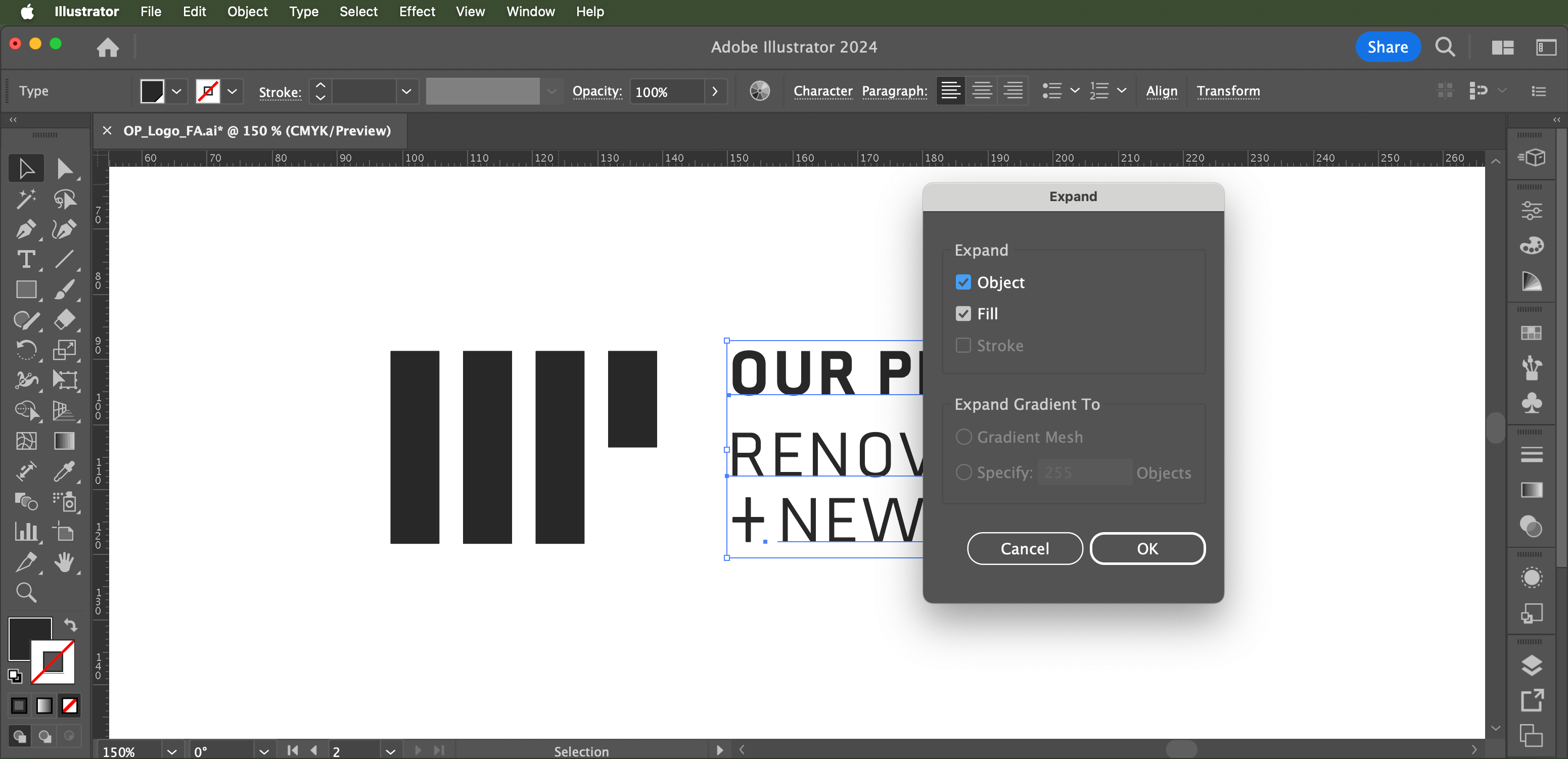
Outline text. Outline any text you've used in the logo by selecting the text, and in the menu going to Object > Expand. This is an important step as it will stop people from opening the logo file and changing the font (intentionally or by mistake).

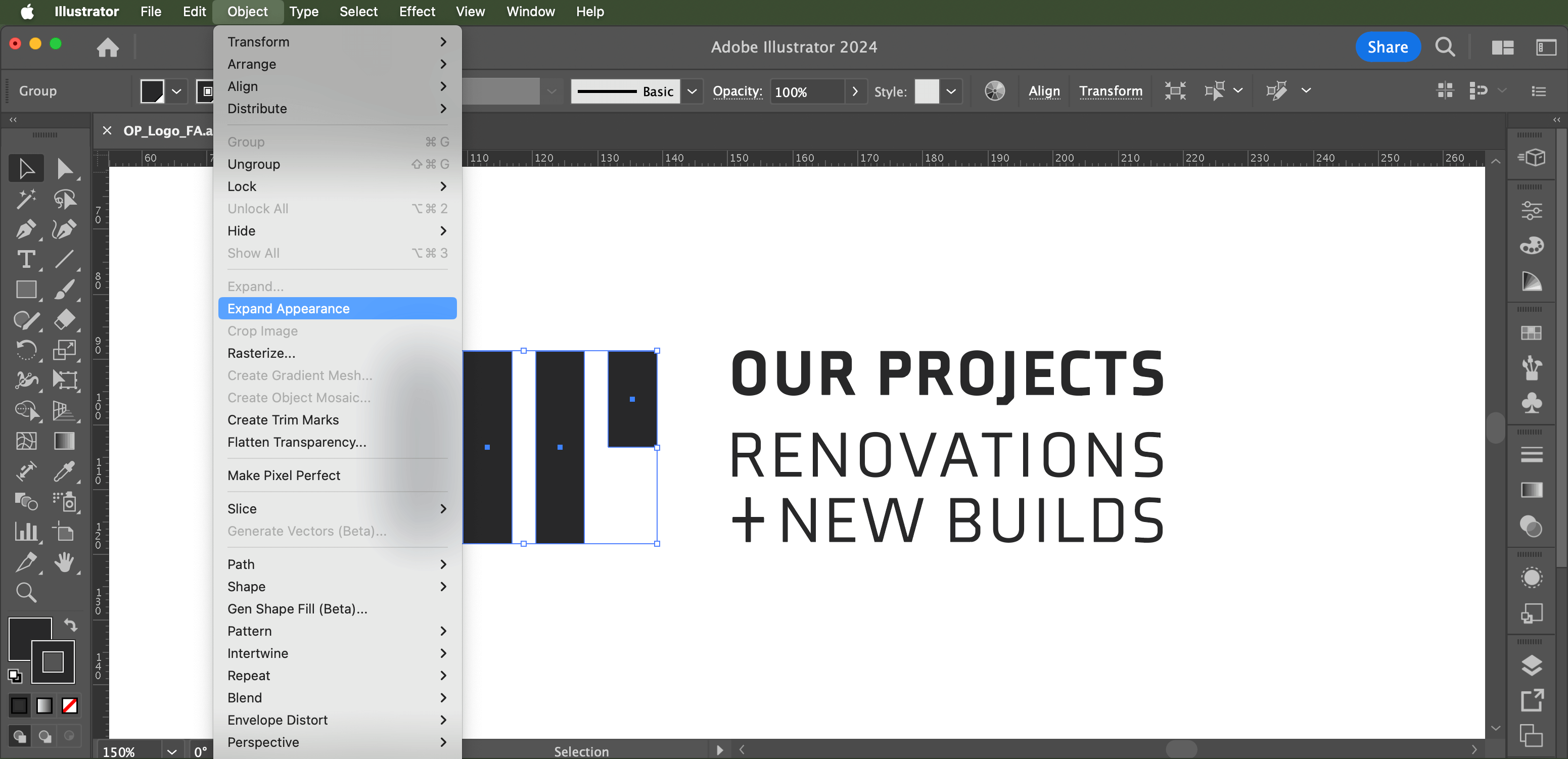
Expand object strokes. Select any objects that have strokes around them, then go Object > Expand Appearance to expand them. This also is important to stop any strokes or outlines from getting bigger or smaller disproportionately when the logo size is changed.
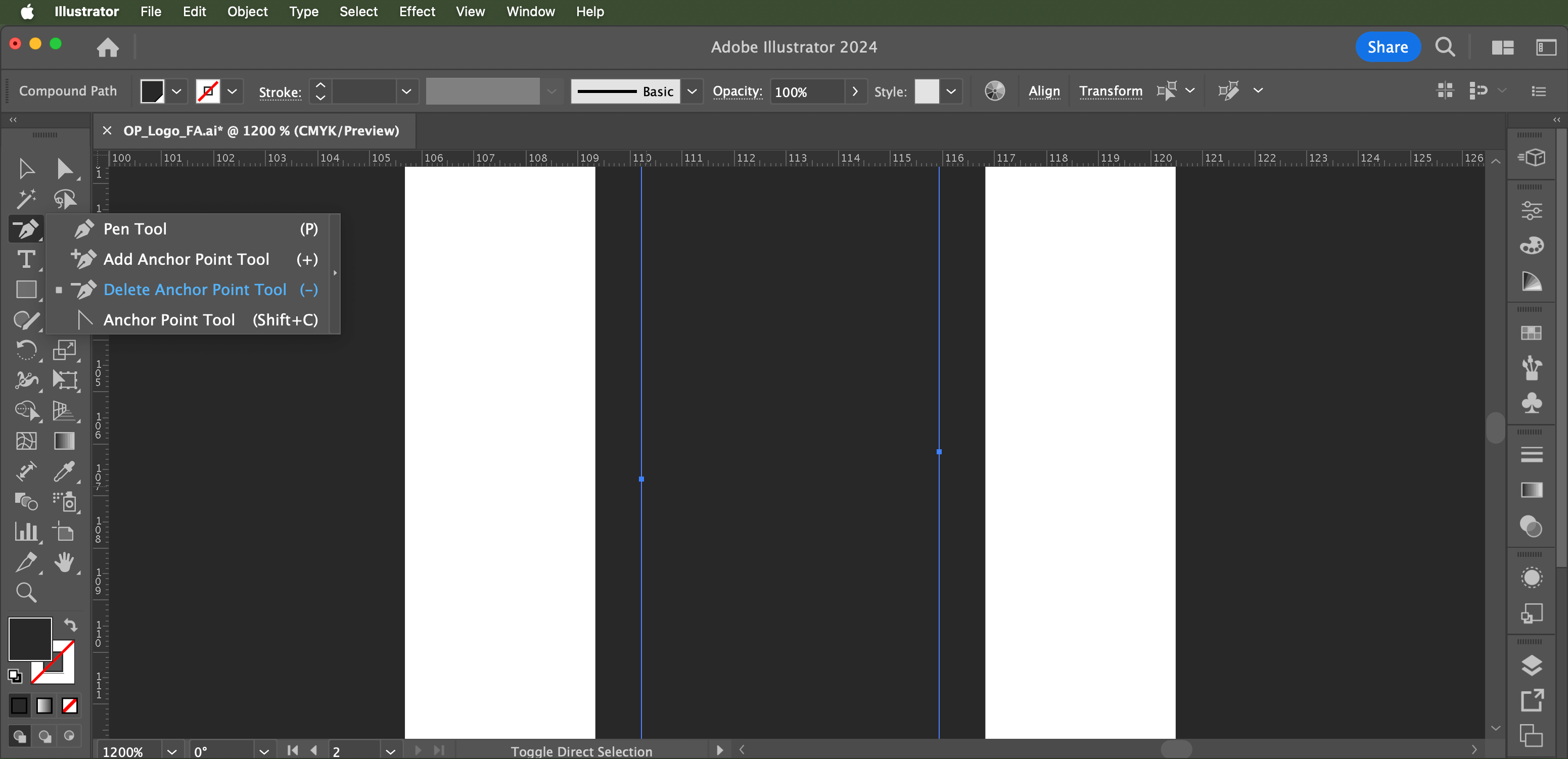
Remove wobbly lines, sharp angles and extra anchor points. Zoom into the vector and get rid of wobbly lines or sharp angular points you might not have seen while zoomed out. In doing this, you'll make sure the logo still looks good when large (such as signage).
Now remove the extra anchor points by selecting the Pen Tool > Delete Anchor Point Tool.
👉 Hold down the 'shift' key when clicking to delete anchor points to maintain any curves. But be aware there are limitations to this depending on how many anchor points you have, and where the are placed.
If you have a tonne of anchor points to delete, instead of deleting them individually you can simplify the path by going to Object > Path > Simplify.
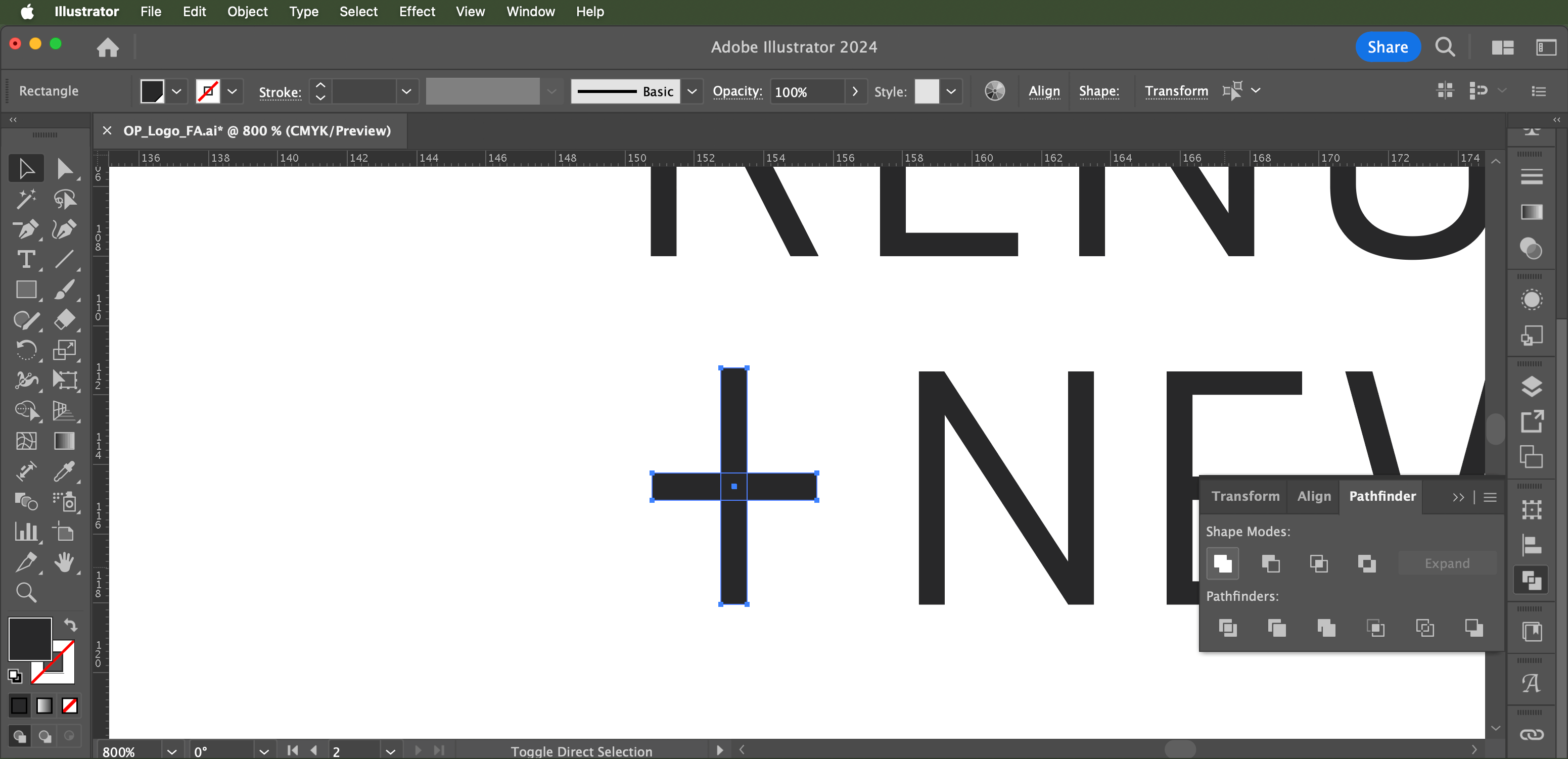
Unite sections. If there are any overlapping lines or areas of colour that are the same, make them one complete object. Go toWindow > Pathfinder and use these tools to unite them. This will ensure the areas of colours are clearly defined and will avoid room for error when reproduced on different mediums.
👉 If you're not familiar with the Pathfinder tool, check out this video.
Group logo artwork. To make sure no piece of the logo gets left behind when you're moving it around in the artboard, select the whole logo and group it by going to 'Object > Group' (or command+G).
Tidy up the swatches
Assign swatches to the artwork. Check that remaining swatches are assigned to the correct colour areas in the logo. Select each different coloured section – in the swatch panel you'll see that the swatch that is highlighted with a white border it is the swatch you’re using for that section. If there’s nothing highlighted, then that colour doesn’t have a swatch, so assign a swatch to it by either making a new one or selecting the swatch it's meant to be.
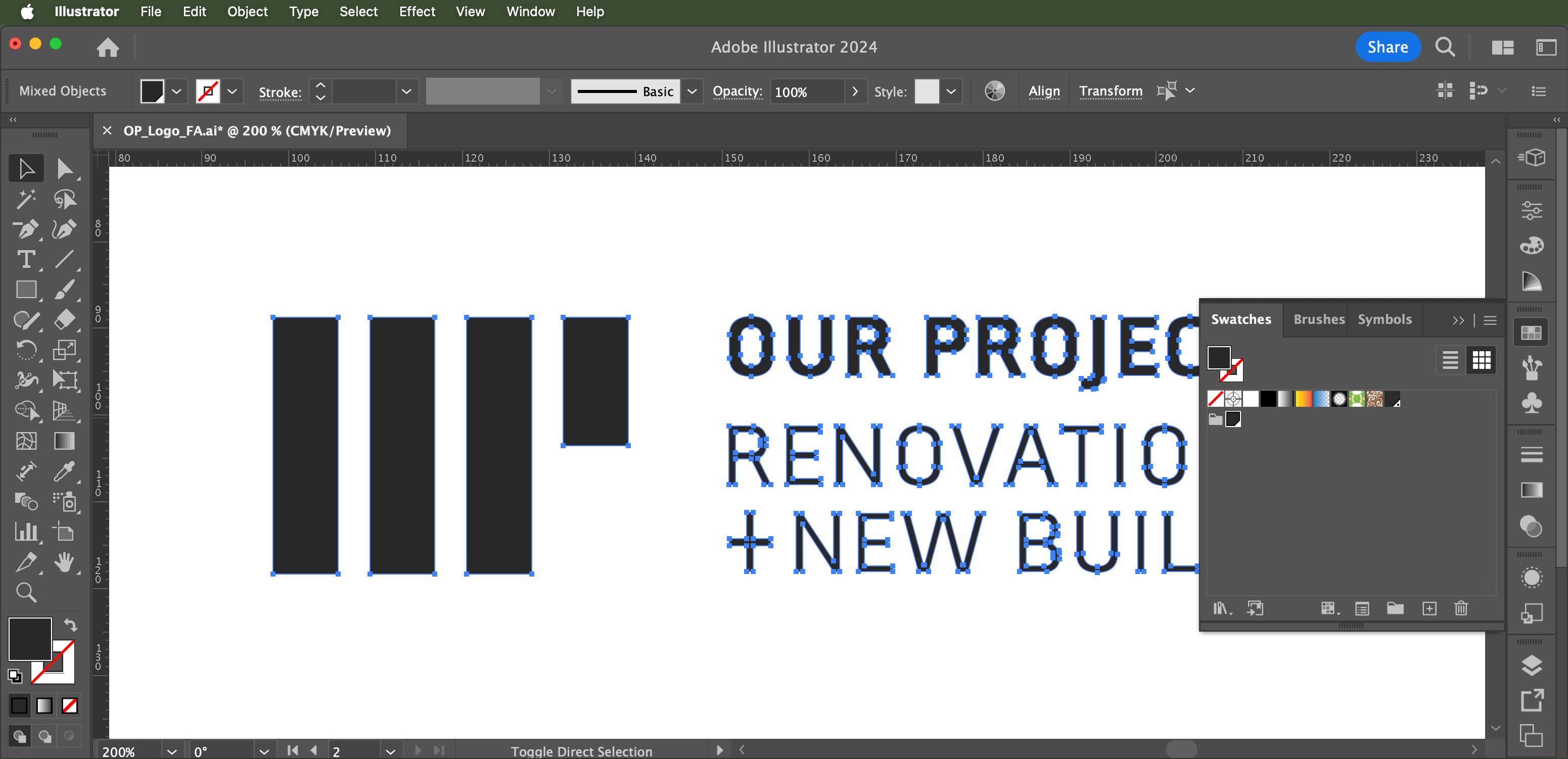
Delete unused swatches. Now with the correct swatches assigned all coloured areas of the logo, go to the swatch panel menu, Select All Unused, then click the trash icon to delete the unused ones. Removing unused colours in your swatches menu will help to define your colour palette and avoid confusion as to what swatches are used in the logo.
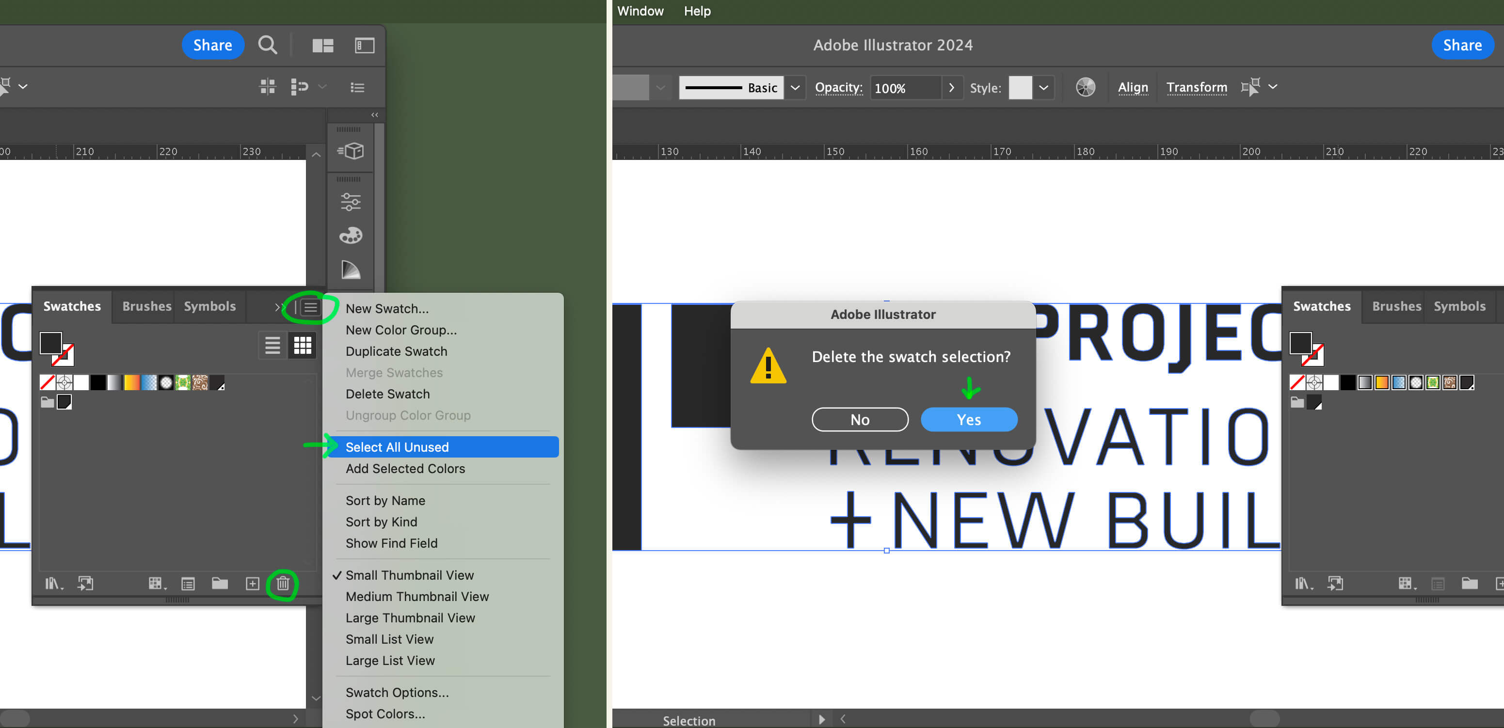
Convert swatches to CMYK. If the document colour mode isn't in CMYK, go to File > Document Color Mode > CMYK Color to change it. This will automatically convert your swatches at the same time. CMYK, which uses cyan, magenta, yellow, and black (K) inks, has a more limited colour range compared to RGB, which combines red, green, and blue light to create a broader spectrum of colours. By using the more restricted (CMYK) palette in your base logo file, you'll get better colour consistency than if you used RGB and converted back to CMYK, which could give you issues if you can’t match the colours well enough.
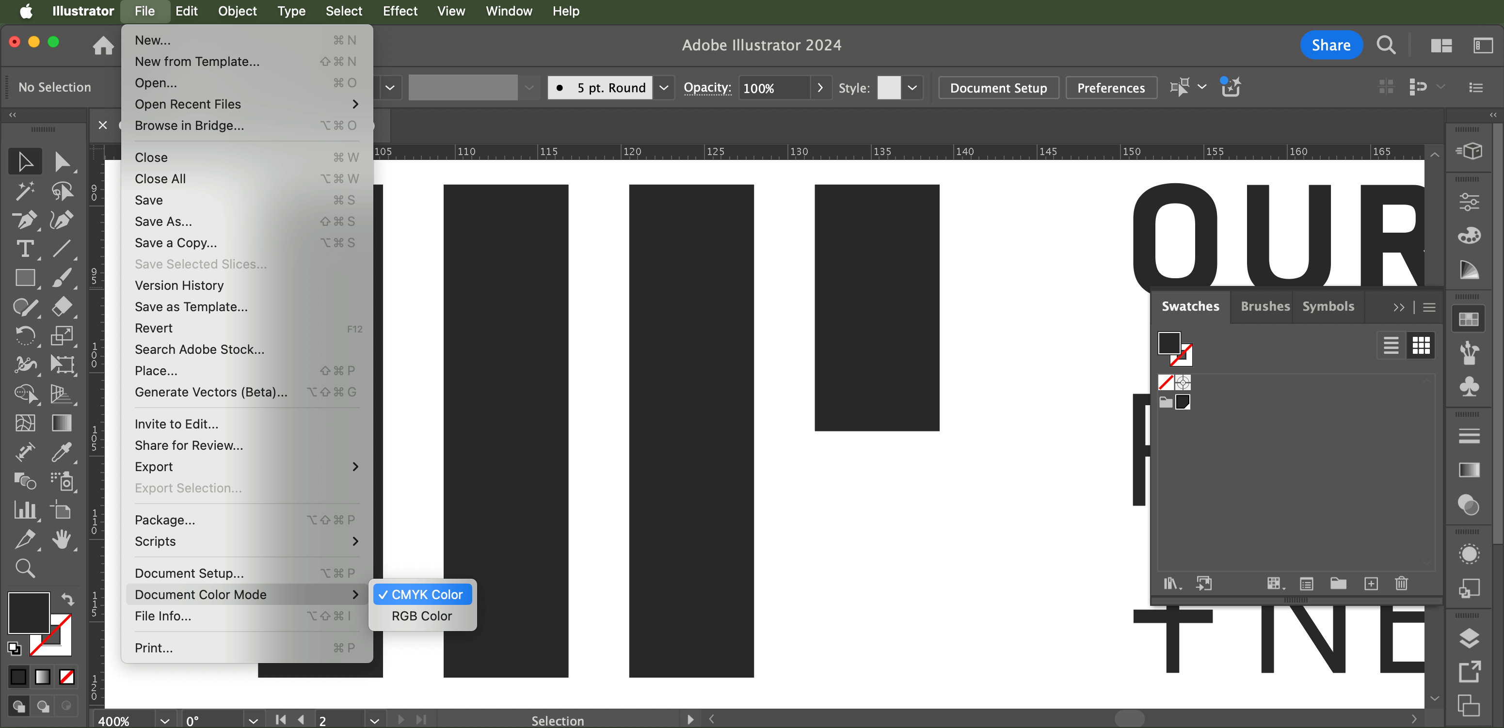
Refine the swatch breakdowns. Double click on each swatch in the Swatches panel to bring up the four CMYK colour channels for each swatch, and:
- Change any decimal numbers to whole numbers. For example, if a channel is 26.86, round it up to 27). This is important because printers can’t produce colours with decimal mixes.
- Aim to reduce the amount of CMYK channels used. By reducing the amount of channels used, you reduce the likelihood of ‘set-off’ in printing, which is when a slight shift in the plates creates muddy print results. If you’re able to achieve the same or very similar colour with three channels instead of all four – or even two – go ahead and do that.
- Tick 'Global' to ensure that changes made to the swatch in the future will automatically apply to areas in the logo that use that swatch.
- A nice little touch is to rename the swatch. For example 'BrandName Almost Black'.
Step 1 done! Now you have a tidy logo file ready, so let's move onto the text step: Create logo variations.
Step 2: Create logo variations
It's now time to create any needed layout variations (sometimes referred to as ‘responsive’ logos), and some colour variations.
To keep things simple at this stage, each variation should be on it's own artboard in the same file in Adobe Illustrator. It's a good idea to save your current logo file how it is at this point, then 'Save As' this file as a separate file with 'CMYK' in the file name (ie. BrandName_Logo_CMYK.ai).
👉 To quickly make each artboard fit each logo variation, go File > Document Setup then click on the 'Edit Artboards' button. In this mode, you can Option+Click each logo variation to create an artboard that perfectly fits around the bounds of the logo. Make sure your logo variation is grouped for this to work properly!
Create layout variations
Let's consider how the logo might be applied in various situations.
Your layout variations might include:
- A primary logo. This is most likely your final approved logo, and will be used in most applications.
- A secondary logo. If your primary logo layout is horizontal, then a variation that will fit better in vertical situations will be needed – and vice versa – if your primary logo is vertical, you'll need a horizontal version.
- Without a tagline. When the logo is reproduced in small print, the tagline may become unreadable. A version without the tagline will be needed in this case.
- Motif-only. If the logo contains a symbol, badge or emblem, create a variation of this so it can be used as a standalone element (ie. as a favicon, app icon, webclip etc).
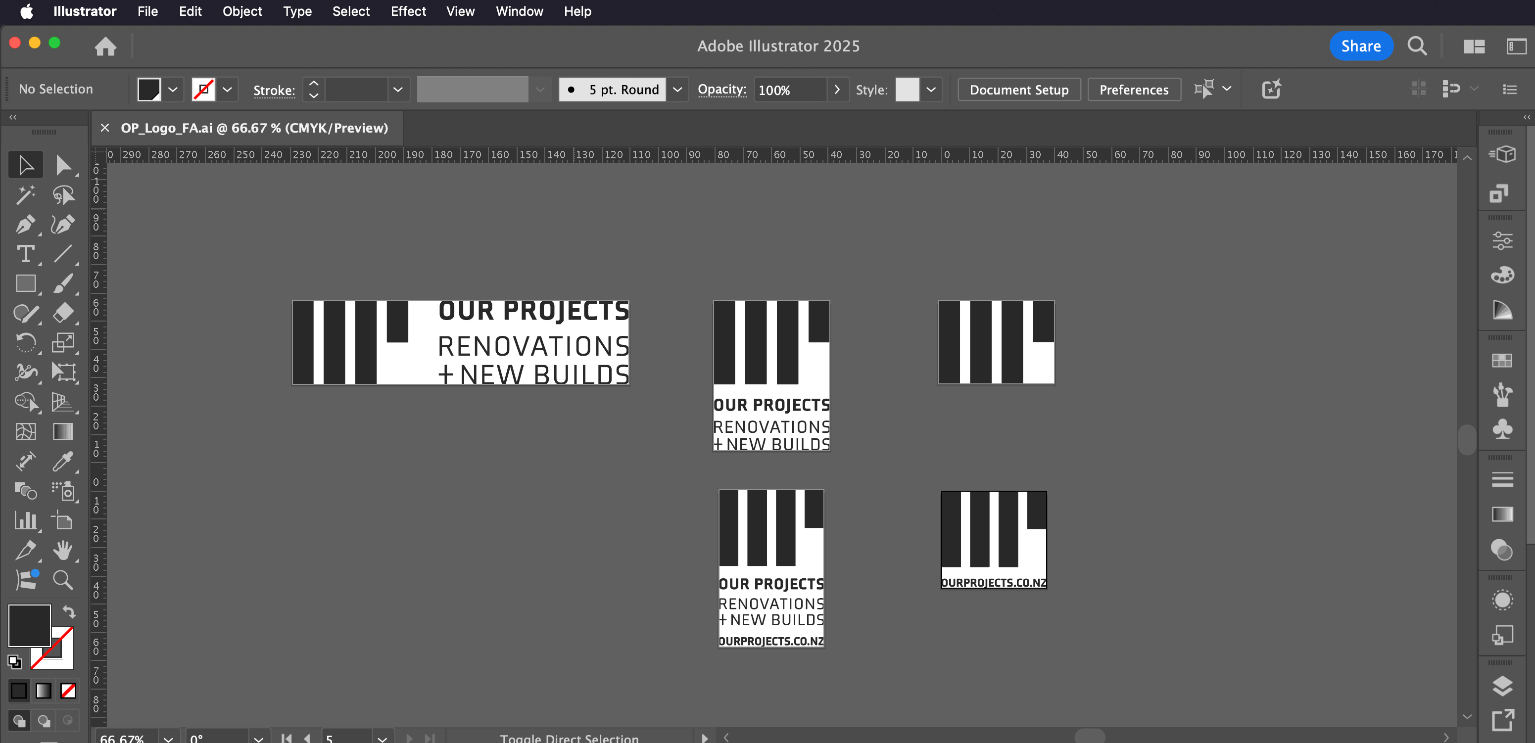
The variations you'll need to create will depend on the type of brand it is, and how you anticipate it might need to be applied. The 'Our Projects' brand I created above is for a building company, and their primary logo (left) is the one mostly used, with the secondary (middle) used only when the primary variation won't fit, such as on their vertical banners. On the lower row you'll see I've included variations that have their web address. This is for instances where only the logo is shown, such as on their tees and other merch. They are a relatively new brand so getting people to their web address is a primary focus – and so this variation helps to achieve this.
👉 Have you seen examples of final logo spreads with lots of variations containing different elements? They look nice altogether as a portfolio piece, but often it’s not clear which one is the ‘primary’ logo. Too many options can water the brand down, so aim to keep the variations cohesive and with a purpose.
Create colour variations
Not to be confused with ‘colour modes’ (ie. CMYK and RGB), colour variations use alternate colourings in the logo. By creating colour variations, the logo will become much more versatile. If your design allows for it – it's a good idea to create an inverted variation, and 'one-colour' mono variations.
Inverted variation. If your logo has shadows and highlights, you will need to create an inverted variation, and offset your design by a couple of pixels, as detailed in James' video below.
👉 If you do offset your design with a stroke, remember to outline the stroke and use the pathfinder tool to make it into one object again to stop the stroke from enlarging disproportionately when resized.
Mono variations. A mono variation is useful for when the logo needs to be produced in one colour, usually for production costs, or in specific scenarios such as when the logo appears with other mono logos (you've probably seen an example of this in event-type advertising). Generally, a light and dark mono version is created.
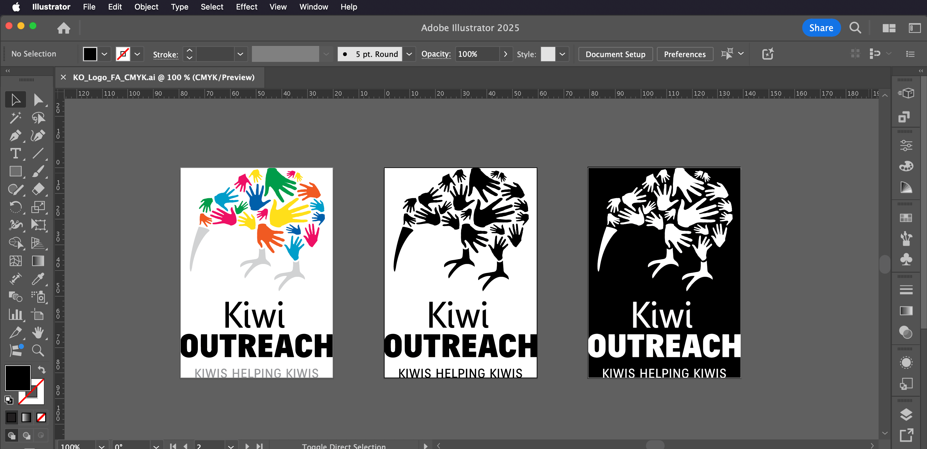
👉 Back in the day.. (showing my age here)... before digital and screens were the main medium and printing and sending faxes was more commonplace – it was standard practice to create greyscale variations for greyscale printing and faxing. This isn’t so common these days, so there isn’t a need to create these variations (unless if specifically requested by your client, of course).
With all of the logo variations prepared, let’s move onto the next step: Package the logo files.
Step 3: Package logo files
With all variations ready to go, it’s time to create the colour modes. Creating these will ensure the logo is seen and can be used consistently across all mediums.
Create colour modes
There are two colour modes you need to have: CMYK (for print), and RGB (for digital). With your base Illustrator file already being in CMYK mode (a task we completed in step 1), we'll convert this file to RGB. But before we do – double check the base file has 'CMYK' in the name.
Now, just as we did in step 1, go 'File > Document Color Mode' and select 'RGB' to convert the document to RGB mode. Now 'File > Save as' this document and update the file name from CMYK to RGB so you know which file is which.
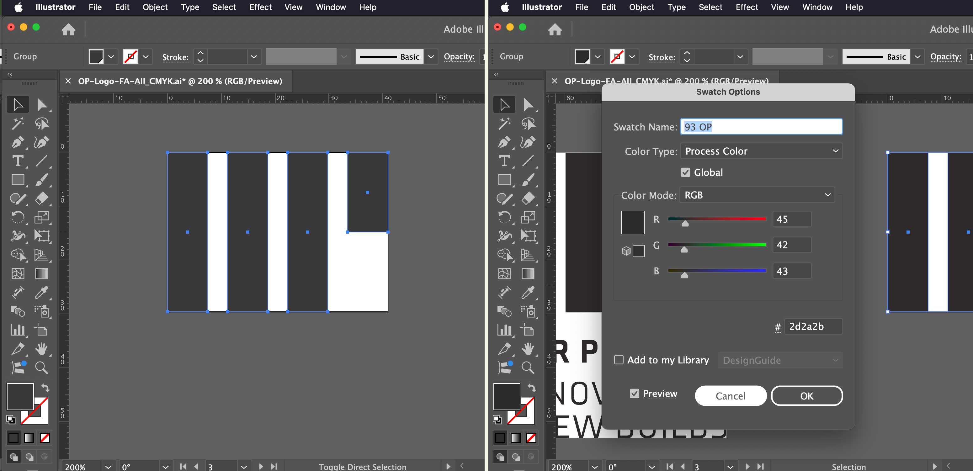
During this conversion, your swatches will have updated to RGB too. Check you are happy with how Illustrator has converted your swatches. In the example below, I was happy with the CMYK colour (0/0/0/93) however the RGB conversion turned the black a little too light – so I updated the RGB values to get it a little darker.
Now you have two base Illustrator files to work from, in both colour modes CMYK and RGB.
Set up folder structure
Before we go on to making the full suite of logo files, let's get the folder that will contain all of your file types ready. The aim of the game here is to make the structure as simple as possible, so the right file type can be found easily.
The folder structure will vary from brand to brand depending on how many variations it has. Here's my structure you can follow:

In this structure, you might notice:
- I've numbered the folders that hold the layout variations. This is so they can appear in a specific order, with the primary variation appearing first.
- In each layout variation's folder, I'm separating out the files by digital and print and I've named them RGB and CMYK. If your client is asked to supply an RGB file, this will help them know which one to select.
- I don't create third level folders (ie 'White' 'Black' or 'Full Colour'). I think this is overkill – the files will be named accordingly (as below) so their colour variations can be identified this way.
Determine file naming structure
Before we begin to make numerous file types, let's determine your file naming structure so it makes sense. Here's my structure you can follow:
BrandName-LayoutVariation-ColourMode-ColourVariation.ai

Create file types
Now with your folder and naming structure good to go, let's use your two base Illustrator files to create a full suite of logo files.
There are a couple of ways create the suite of logo files – either manually saving and exporting, or by using an Adobe Illustrator plugin called ‘Logo Package Express’ (affiliate link).
If you’re fairly new to this process or can't quite afford the investment into Logo Package Express, I've detailed the manual method below you can follow. It will take more time – but it's good to learn so you understand the process fully.
Here's an overview of the file formats we'll be creating in the two colour modes:

👉 Where's Pantone? Pantone Colour Libraries are no longer included in Adobe Creative Cloud as a default due to licensing changes. Because of this, I no longer provide Pantone files as part of my final logo package. However I have the Adobe Illustrator plugin ‘Logo Package Swatch’ that can convert colours to Pantone. By using this, I can include Pantone options in my brand guidelines but not worry about including them as a file type. To get 20% off Logo Package Swatch (affiliate link), use my code: designguide20 at the checkout.
👉 What about CMYK EPS Files? Vector PDF and EPS files both speak the same language – PostScript (invented by Adobe in the 1980’s). Most printers with modern workflows consider EPS files outdated, and use PDF files because they are more flexible and have less transparency and colour consistency issues than EPS files. Some printers who use older software or workflows may need an EPS file, so it’s up to you whether you want to include an EPS file in your package or not, or just leave it up to the signwriter to do the PDF to EPS conversion themselves if they need it.
CMYK (print) file types
For CMYK, we'll create both AI and PDF file types.
AI (Adobe Illustrator) files: Because all of your logo variations are currently in your base CMYK file in Illustrator, we need to create separate files for each variation. With the file open, go 'File > Save As > (choose folder) > Save'. When the 'Illustrator Options' box appears, tick 'Save each artboard to a separate file'.
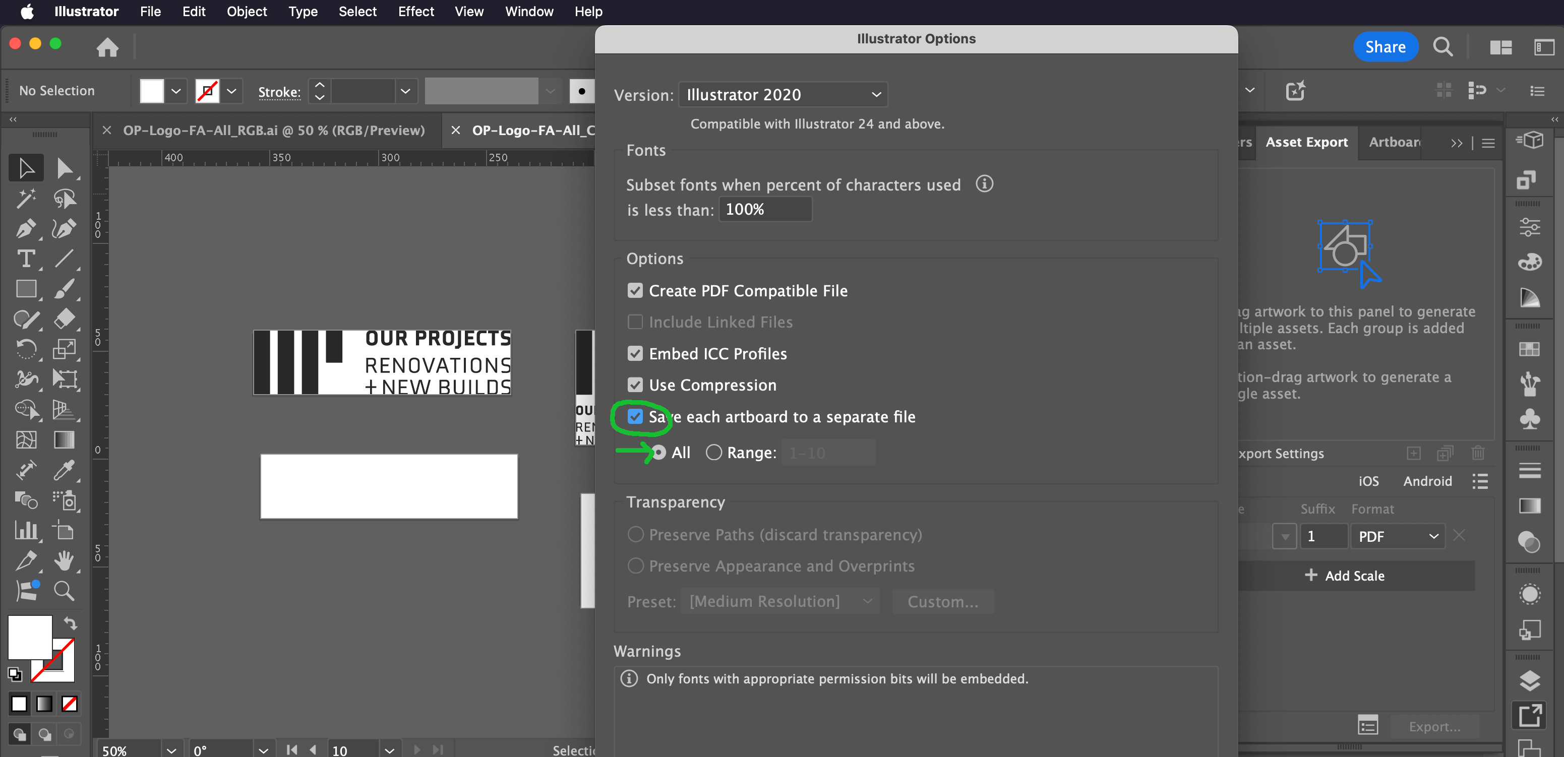
Now go through and name each separate illustrator file using your naming structure, and pop them into the relevant 'Print (CMYK)' folders.

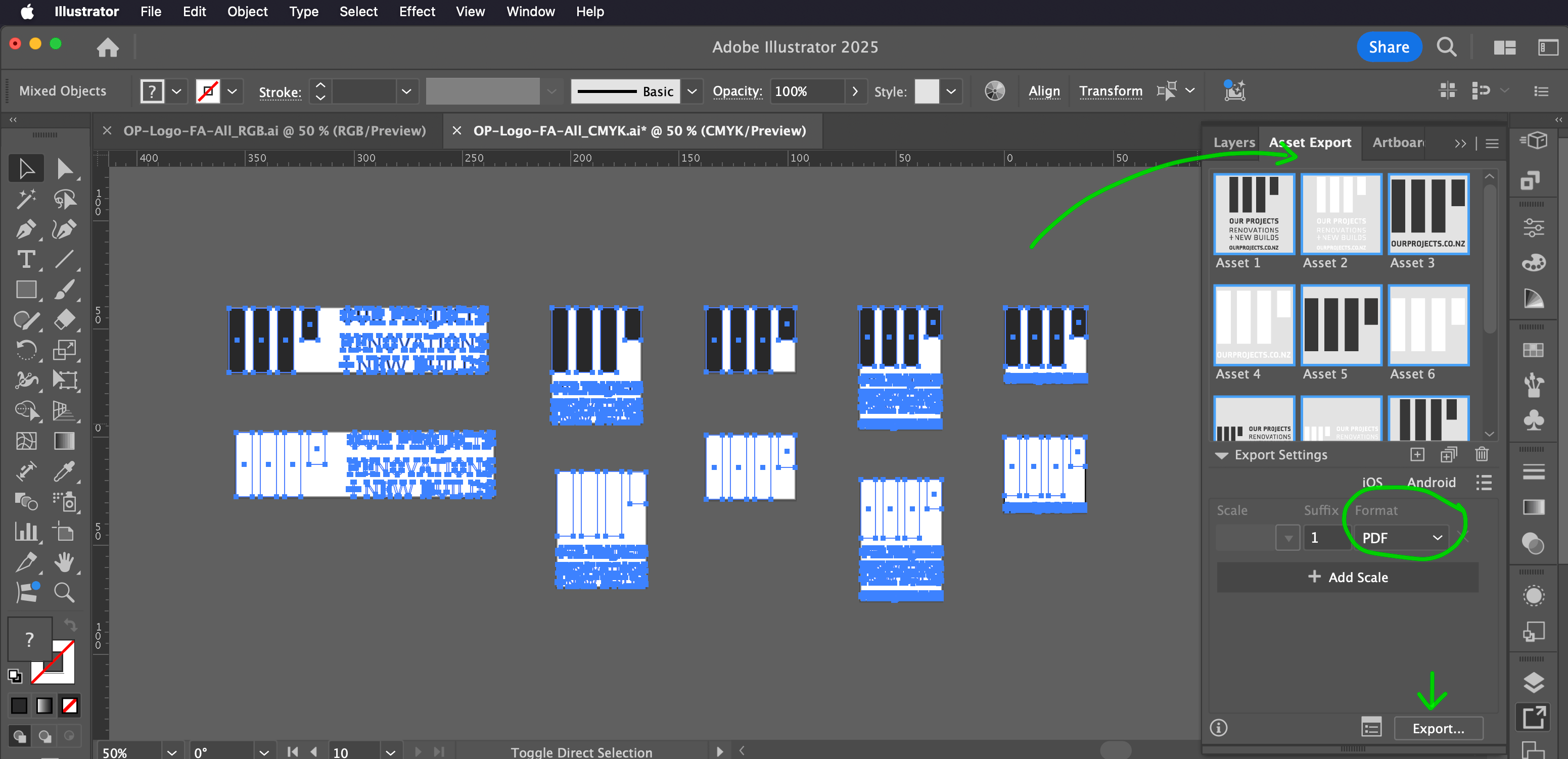
PDF files: Now go back to your CMYK Illustrator base file, and go 'Window > Asset Export'. Once your 'Asset Export' window is open, select all of your logo variations at once, then drag them into the panel (make sure each logo is grouped!).
Once they're in the panel, rename each asset using your file naming structure so that when you export them they'll already be named how you want them.
👉 In the Asset Export menu, change from 'Grid View' to 'List View' to see more of the Asset name.
.png)
Once they're all renamed, select all the assets you want to export (Shift+Click), choose 'PDF' format in the dropdown below, and click the export button.
And that's it for the CMYK files – now let's make the RGB files.

RGB (digital) file types
For RGB, we'll create AI, PDF, SVG, JPG and PNG file types.
Let's open up your base RGB Illustrator file type and follow the same steps as above to create your individual AI (Adobe Illustrator) files.
Now – as you did with the CMYK version, drag all of the logo variations into the 'Asset Export' panel and rename them using your file naming structure.
Then go to your 'Export Settings' below, and add all four formats, by clicking on the 'Add scale' button – as below:
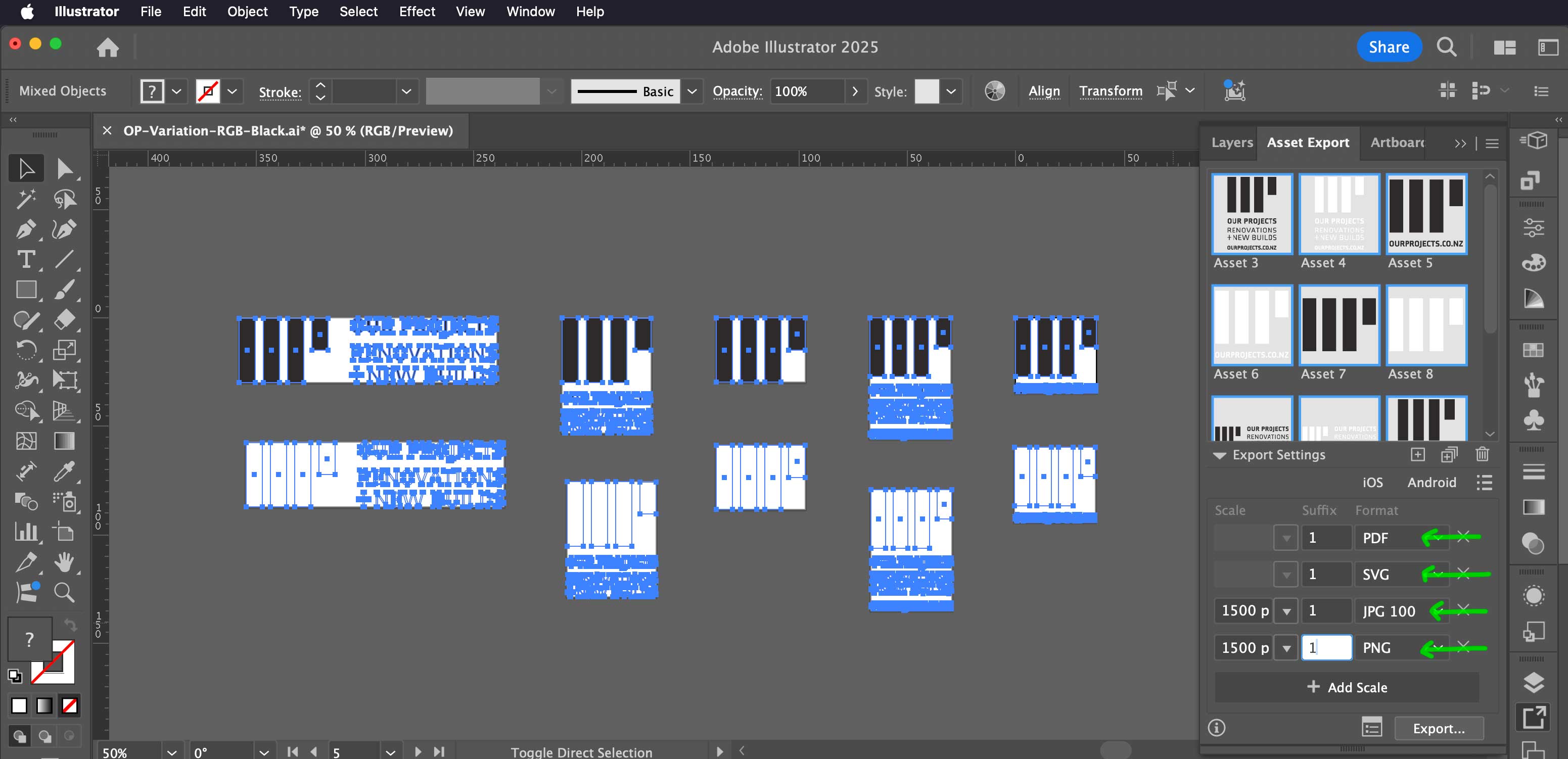
- For JPG, I've chosen 'JPG 100' because that's the best quality.
- On both JPG and PNG options, I've set them to 1500px wide so when they are used digitally they are big enough to look good, but not too big of a file. Select the 'Scale' dropdown, select 'Width' and type in how wide you want the file to be.
- Keep the suffix as 'None', because you've already named the assets individually.
👉 You can save these settings so they are ready for next time in the 'Export Settings' panel menu (the three lines stacked above each other in the top right of the panel). Open it, and 'Save As Preset'.
Now, press the export button and all the various file types will be created. Nice! All that's left to do is rename them and move them into their correct folders.

With all of the files created and tidied nicely away into folders, let’s move to the next step: Create guidelines.
👉 Logo Package Express Method. As mentioned earlier in this step, you can use ‘Logo Package Express’ (affiliate link), to quickly export file types in less than 5 minutes – use the code designguide20 to get 20% off at the checkout. But – I used the above manual method for years until I could afford this product.
Step 4: Create guidelines
Providing as much information as you can about logo file types and how to use them will create a solid foundation for ensuring the logo is used correctly. In the previous step you put a lot of effort into thinking about how the logo might be used in different situations, and it would be a shame for it to go to waste by not providing any guidelines for use.
There are two types of guidelines that should to be created – a ‘Logo File Formats Guide’ and ‘Brand Guidelines’.
Create a Logo File Formats Guide
This is a simple document that explains what the colour modes and file types are, is and where they should be used. Choosing logo files can be overwhelming for non-designers, so be sure to use simple language and explain things well.
You should provide explanations for all colour modes – RGB, CMYK and Pantone/Spot (even if you don't supply Pantone versions). And for the formats – AI, PDF, SVG, PNG, JPG (and EPS if you decided to supply those formats).
This document can be as simple as a .txt file, or if you want to get fancy you can create a template, like I have here:

👉 You can get this ‘Logo File Formats Guide’ InDesign Template in my Logo Design Process Kit. This template has paragraph styles set up so you can quickly update the fonts and colours used in it.
Create Brand Guidelines
There are two kinds of brand guidelines you could create. One is a one-pager and the other is a multi-page document.
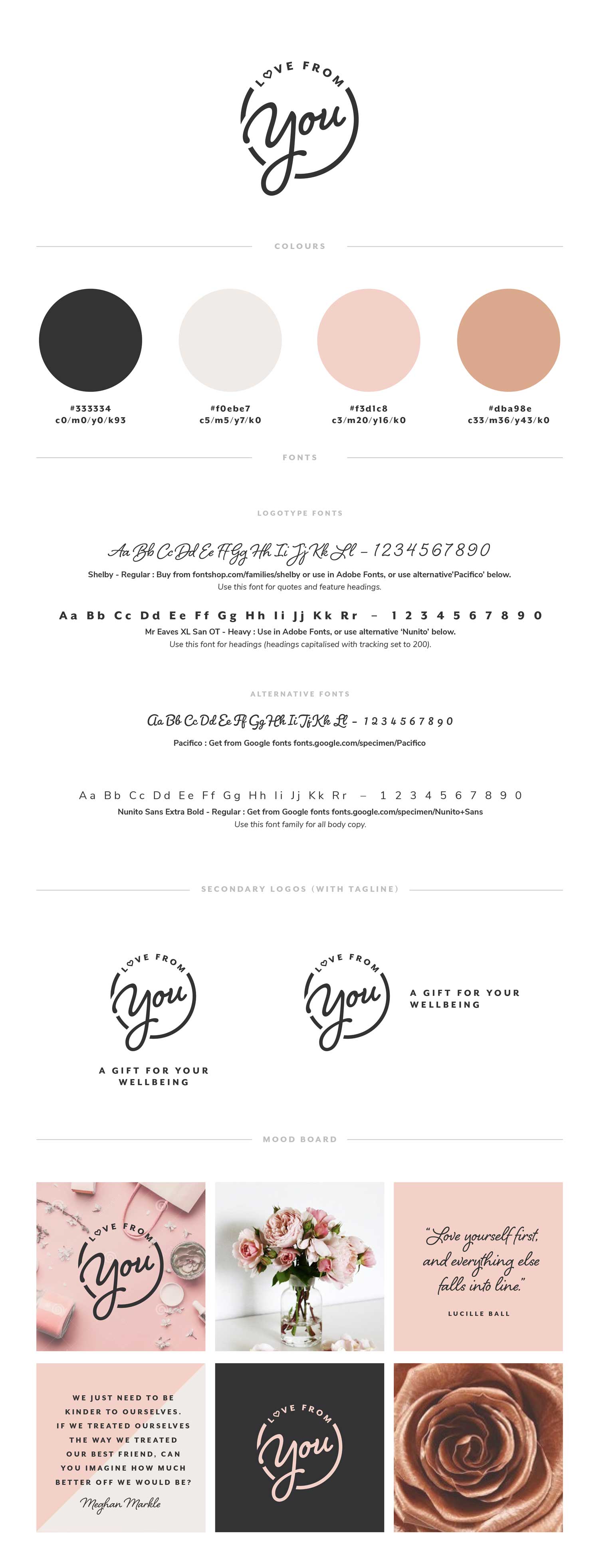
Brand Board. This is a one-pager that is concise but shares info that someone might need for quick reference. It should at a minimum include the main logo and it's variations, as well as fonts and colours.
Brand boards are great for startups – often they don’t have a lot of money to spend on developing comprehensive brand guidelines but need a logo to get started and basic brand info for setting up their website and socials.
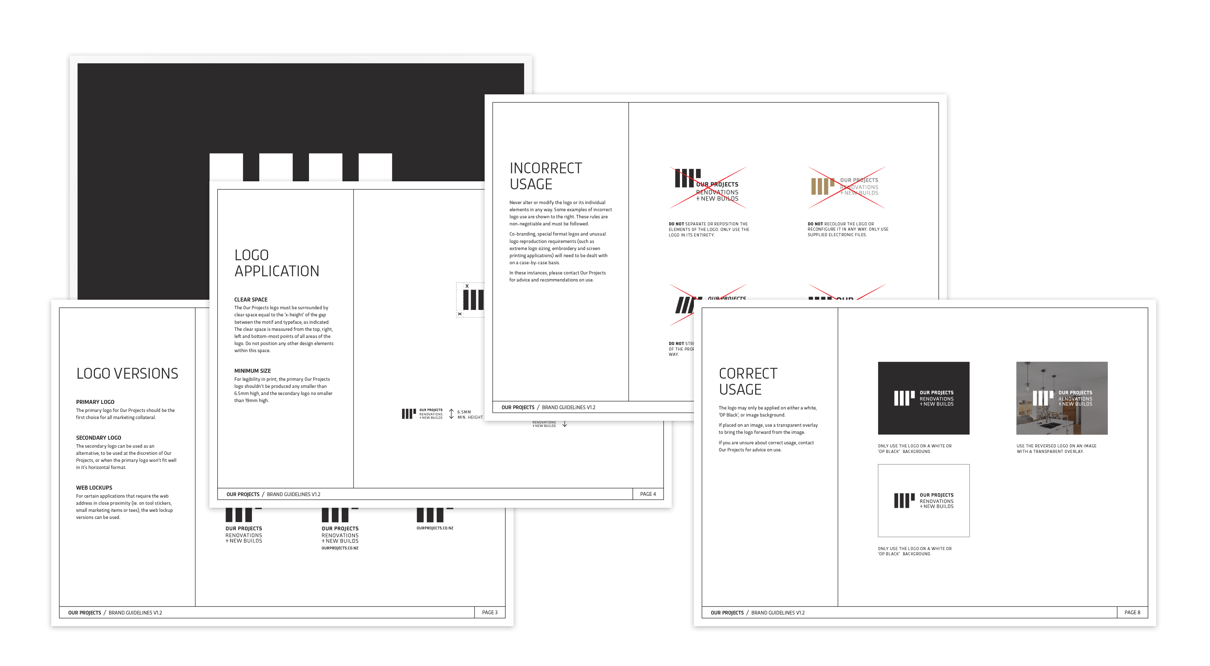
Brand Guidelines Document. This is a much more comprehensive document. Bigger brands often have a bigger budget so can start with more comprehensive documents from the get-go, but often they are created after the brand has developed over the years and they’re at the stage where they're looking to put in place some guidelines to make their marketing material more consistent and cohesive.
👉 Take a look at Branding Style Guides for some inspiration for your brand guidelines.
Once the guidelines are done, export them as PDF and place them in your final logo files folder. I like to underscore them so they're first thing seen when you open the folder – and it might also help to put a ‘READ-ME’ in the file name to help it stand out... (ie _BrandName-Guidelines-README.pdf).
Now we’re ready to deliver the final logo package!
Step 5: Deliver final logo package
At this point, it might be tempting to send off the final logo package and consider the project done and dusted. Yes – we'll send off the logo package in this step – but it’s also important to take the time to gather feedback and debrief while the process is still fresh in both your mind and your client’s.
Send final logo package
With your final logo file folder ready, upload it to a file-sharing site like Dropbox or Google Drive, and send your client the link along with an overview of its contents. This will ensure they don’t miss any guidelines and understand what is included.
👉 An alternative approach to sending the package is to zip the folder and email it (if the file size permits) or send it via a file transfer site like WeTransfer. However, with this method clients may reach out again for the files if they misplace or accidentally delete them. By providing a link to the online folder, your clients can easily access the files anytime and share the link with anyone else who needs them. Plus, if you ever need to update the logos, the link remains the same – ensuring your client always has access to the correct versions without older versions cluttering their computer and causing confusion.
Get feedback
Now that you’ve sent off the final logo package, it’s time to gather some feedback and find out how your client felt about the process. Keep the questions to a minimum – you don’t want to overwhelm them to the point where they don’t respond at all. You could ask them:
- What was it like working with me throughout my logo design process?
- What part of my process did you enjoy the most?
- Is there anything that could have made my process better for you?
By gathering feedback, we not only gain valuable insights but can also use their responses as testimonials (with their permission, of course – make sure you ask for it!). The great thing about asking questions instead of requesting a written testimonial is that it removes a barrier – testimonials can often be difficult to initiate, which reduces the likelihood of receiving one.
Debrief the process
In this final step, we'll review any feedback you received from your client about your process and conduct an internal debrief to assess how you handled things. This will give you insight into what's working well and where you can improve.
Look back over the previous steps — the brief, your notes, sketches, and development process – and ask yourself:
- Which parts of my process felt easy, and why?
- Which parts of my process felt challenging, and why?
- Based on these reflections and my client's feedback, what can I change next time to improve my process?
👉 I also like to tally how many hours all up this process took me and record it somewhere so I can gather data over time to see how I'm progressing.
By answering these questions, you'll be able to identify which steps need extra attention and what skills you need to improve, so you're better next time you go through this process.
Remember, you’re more than just your work. Being objective and critiquing yourself can be tough, but it’s essential for improving the quality of what you create. So, give yourself a break and focus on striving to be better next time!
Closing thoughts
Hopefully, this guide has clarified your process for preparing logo files and will help you deliver professional final logo packages that leave a lasting, positive impression on your clients.
If you’re interested in learning how other designers approach this process, I conducted a survey in 2023, and you can see the results here. Remember, everyone approaches things differently, so find what works for you and adjust your process accordingly.
I’d love to hear if this guide has helped your logo design process. And if you have any suggestions for improvement, feel free to email me and let me know.
When you’re ready, and if it doesn’t cause you financial hardship, consider upgrading your logo design process with my Logo Design Process Kit. It’s a customisable Notion step-by-step process kit designed to help you quickly and easily work through your logo design process with clarity and confidence.


